
3.2Common properties
The properties that almost every UI object shares - label, text style, images, access control, protocol, position, size and image transform - and what each one does.
Select any object on a page and the Properties panel shows its fields from top to bottom: label, text style, images, access control, the object's own bindings, then position and size. The first and last groups are the same for almost every object type, and this page describes them once. The object pages in this section only list what is specific to that object.
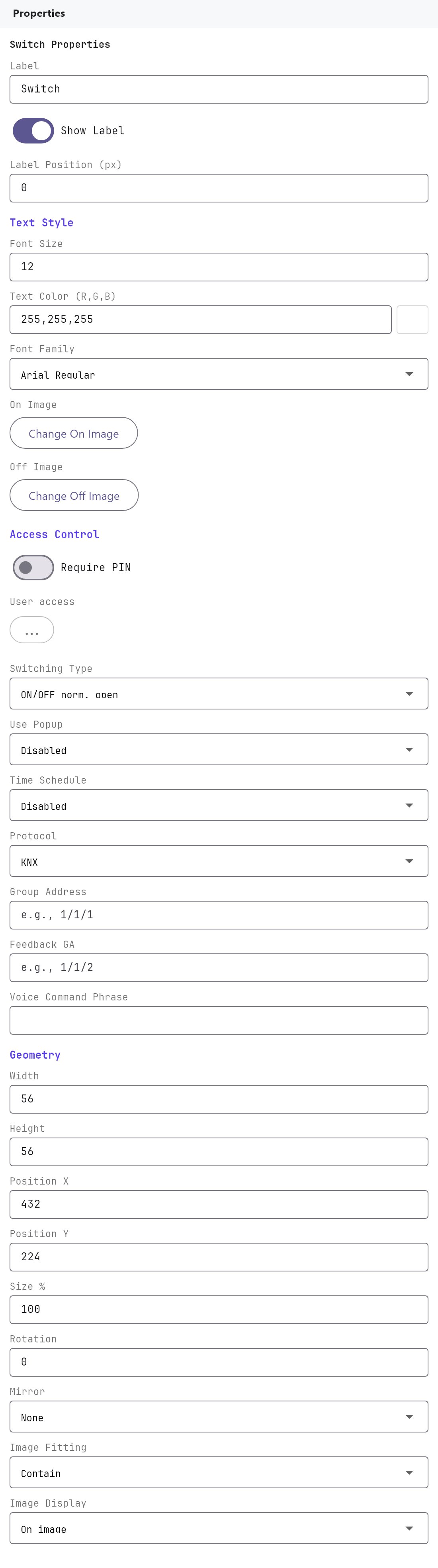
Some fields are hidden for object types where they would have no effect. The last table on this page shows which.
#Label
| Property | What it does |
|---|---|
| Label | The object's name. Icon objects show it as a caption next to the icon in the apps. |
| Show Label | Shown (default) or Hidden. Hidden removes the caption and leaves only the icon. |
| Label Position | A vertical nudge for the caption, in pixels, from -50 to 50 (default 0). Positive values move the caption down, away from the icon; negative values move it up. Use it when a custom On/Off image has more or less empty space around the artwork than the built-in icon. Only shown while Show Label is Shown. |
#Text style
| Property | What it does |
|---|---|
| Font Size | Caption size in pixels, from 8 to 200. Default 12 for icon objects, 24 for Analog Value, 15 for Static Text. |
| Text Color | Click the swatch to pick a colour. It is stored and shown as three numbers, red, green and blue, from 0 to 255. Default 255,255,255 (white). |
| Font Family | Arial Regular (default), Arial Bold, Times New Roman Regular or Bold, Courier New Regular or Bold, Verdana Regular or Bold, Georgia Regular or Bold. |
The Text style group is not shown for the full-screen panels (Watering, AC, Genset, Generator, UPS, Solar and their generic versions) or the Power Flow Panel.
#On, Off and Dim images
| Property | What it does |
|---|---|
| On Image | The picture shown while the object is on. The button reads Change On Image once an image is set, or Use Custom On Image while the built-in default is in use. It opens the image gallery. |
| Off Image | The picture shown while the object is off. Same behaviour as On Image. |
| Dim Image | Dimmer Light only. The picture shown when the light is on but between 0% and 100%. |
| Picture | Picture objects only. Replaces the On and Off images with a single image. |
Each object type comes with default images, so you only need to set these for custom artwork. The image gallery and its library are described under Clip art library below. Objects that draw their own graphics (Analog Value, Static Text, State Action, Action Button, Clock, Camera, Intercom, Graph, Energy Flow Line and the panels) have no On/Off image fields.
#Clip art library
The image gallery (opened by On Image, Off Image, Dim Image, Picture and similar buttons) has two tabs:
- Default: the built-in images, about 190. They are grouped by Gauges, Lights, Security, Climate, Awnings, Scenes and Other. Many come as an On and Off pair, such as lamps, pumps, a slide switch and a round power button. Climate has fan icons (red off, green on, yellow dim), snowflakes and weather icons, and Other has energy images such as a grid tower, a solar panel, a UPS and a generator.
- Custom: your own images. Import Custom Images opens a file dialog where you can pick several files at once (PNG, JPG, GIF, WebP or BMP). Each is stored inside the project file. A name that is already used gets a number (
logo_1.png). Importing a file that is already in the library adds another copy and tells you so.
A custom image has a delete button. Deleting it asks you to confirm, removes it from the library and clears it from every object that uses it.
Managing the library without an object. The Clip Art button in the top toolbar (next to Settings) opens the same gallery as the Clipart Library. You can import and delete images there without choosing one for an object. It needs an open project, and the project is saved when you change the library.
#Access control
| Property | What it does |
|---|---|
| Require PIN | Off (default) or Required. The user must enter their PIN every time they use the object. |
| User access | A ... button. Click it to open the editor, tick the users who may see and use the object, and click OK. Leave everyone unticked to allow all users. The button turns purple when the object is limited to some users, and hovering it names them. Select all users and Clear selection help with long lists. |
#How access control works
- User access. The apps hide the object from every other user. The gateway also refuses commands for it from anyone else, so a modified or outdated app cannot get around it.
- Require PIN. The app asks for the user's PIN each time the object is used and never stores it. The gateway checks it against the PIN set for that user in Server > Gateway > Users. After 5 wrong PINs in a row the user is locked out for 5 minutes. A user who has no PIN cannot use a PIN-protected object.
- Both together. Only the listed users see the object, and they must still enter their PIN.
What is not covered:
- Voice control (Apple Home, Alexa, Google Home). It works for the owner's own voice assistant and has no signed-in user.
- Commands that run on the gateway by themselves: schedules, rules, Logic Studio and scenes triggered from KNX.
- Camera and intercom viewing.
- Other users of the same KNX group address outside Veltnova, such as a wall switch.
Apps released before this feature do not hide objects or ask for the PIN. The gateway still refuses their commands for protected controls, so they simply fail.
#Protocol and addresses
| Property | What it does |
|---|---|
| Protocol | KNX, Zigbee, WiFi or MQTT. State Action, Analog Value and Energy Flow Line also offer System Object. Not shown for Static Text, Picture, Page, Action Button, Camera, Intercom, Graph, Energy Flow Line or the full-screen panels. |
| Group Address | With KNX, the group address the object writes to, for example 1/1/10. If you imported your ETS group address list, the field suggests addresses as you type, each shown as address, name and data type. For HVAC the field is labelled ON/OFF Group Address and for Roller Shutter Move Group Up/Down. |
| Group Address / Device ID | The same field when Protocol is not KNX. With Zigbee it becomes a drop-down of values from the Zigbee devices you added to the gateway, such as Hallway Light - On/Off (Gang 1). With WiFi or MQTT it is a free-text device ID. |
Control objects pair this write address with their own status (feedback) fields, described on each object's page. See KNX basics for installers for importing group addresses.
#Voice
| Property | What it does |
|---|---|
| Voice Command Phrase | The name voice assistants use for the object, for example Pool Lights. Leaving it empty keeps the object out of voice control. |
| Room | An optional room name, for example Backyard, sent to the voice integrations together with the phrase. |
Only Switch, Dimmer Light, RGB Lamp and Ceiling Fan have these two fields. An object with a phrase is published to the voice integrations set up on the gateway (Apple Home, Alexa and Google Home through the Voice Gateway service) and, when MQTT discovery is on, to Home Assistant. Voice control currently covers KNX-bound objects.
#Position and size
| Property | What it does |
|---|---|
| Width, Height | The object's base size in pixels, minimum 1. Defaults are 56 x 56 for single-icon controls (Switch, Dimmer Light, RGB Lamp, Ceiling Fan, HVAC, Roller Shutter, Scene) and 96 x 64 for most others. |
| Position X, Position Y | Distance in pixels from the left and top edges of the page. Whole numbers. |
| Size % | Multiplies Width and Height. 100 is the base size; the range is 10 to 1000. |
#Image transform
| Property | What it does |
|---|---|
| Rotation | Rotates the image, in degrees (default 0). |
| Mirror | None (default), Horizontal, Vertical or Both. Flips the image. |
| Image Fitting | How the image fills the object's box. Contain (default) shows the whole image, keeping its proportions. Cover fills the box and crops the overflow. Stretch fills the box and distorts the image if the proportions differ. Native shows the image at its own size, anchored at the top-left. Center shows it at its own size, centred. |
| Image Display | On image (default) or Off image. Chooses which image the Configurator canvas previews while you design. |
Rotation, Mirror, Image Fitting and Image Display are not shown for the full-screen panels, Analog Value or Static Text. Mirror, Image Fitting and Image Display are also hidden for Graph and Energy Flow Line, and Image Display is hidden for Picture.
#Time Schedule
Time Schedule appears on the Switch object only, when its Switching Type is one of the two ON/OFF modes. It is described on the Switch page.
#What the Veltnova client applies
| Field | Veltnova client |
|---|---|
| Label, Show Label | Applied |
| Label Position | Applied to icon objects and Picture (State Action too) |
| Font Size, Text Color, Font Family | Applied |
| On, Off and Dim images | Applied |
| Position X/Y, Width, Height, Size % | Applied |
| Rotation, Mirror, Image Fitting | Applied to the image of icon objects and Picture. Not applied to Action Button and State Action |
| Image Display | Not applied |
The Veltnova client shows an icon object as Off until it has received a status for it.
#Which objects show which fields
| Field group | Hidden for |
|---|---|
| Show Label, Label Position | Full-screen panels, Power Flow Panel, Camera, Intercom, Energy Flow Line, Graph, Analog Value, Static Text |
| Text style | Full-screen panels, Power Flow Panel |
| On/Off images | Picture, Analog Value, Static Text, State Action, Action Button, Clock, Camera, Intercom, Energy Flow Line, Graph, all panels |
| Width to Size % | Page |
| Rotation, Mirror, Image Fitting, Image Display | See the Image transform section above |