
3.29State Action
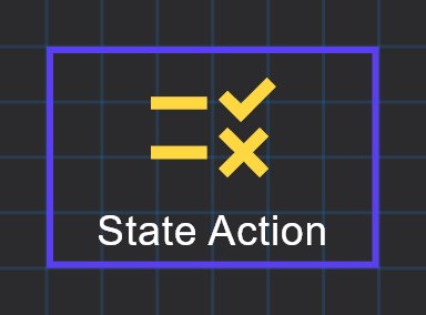
Shows a picture or text that depends on a live value, using as many threshold-based states as you need, and can also run an action when tapped.
The State Action shows the current state of a value. You define a list of states, each with a threshold. The object shows the picture or text of the state whose threshold the live value has reached. It can also run an action when tapped, such as jumping to a page or writing a value to KNX.
#When to use it
- A status icon that changes with a KNX value: door open or closed, alarm armed or not, a gauge image per power band.
- A text display that shows a word per value range, for example
Closed,Half open,Open. - A live text from a gateway calculation, such as prayer times, sunrise or sunset, a Modbus or Zigbee reading, or a Network I/O or Rule Gateway value. Use the System Object protocol for these.
For a plain number with a unit, use an Analog Value. For on/off control, use a Switch.
#What you need first
- For a KNX value: the group address that carries the value or its status. Import the ETS list first for autocomplete (see KNX basics).
- For a System Object: the matching gateway service configured and enabled, so the value exists.
#Properties
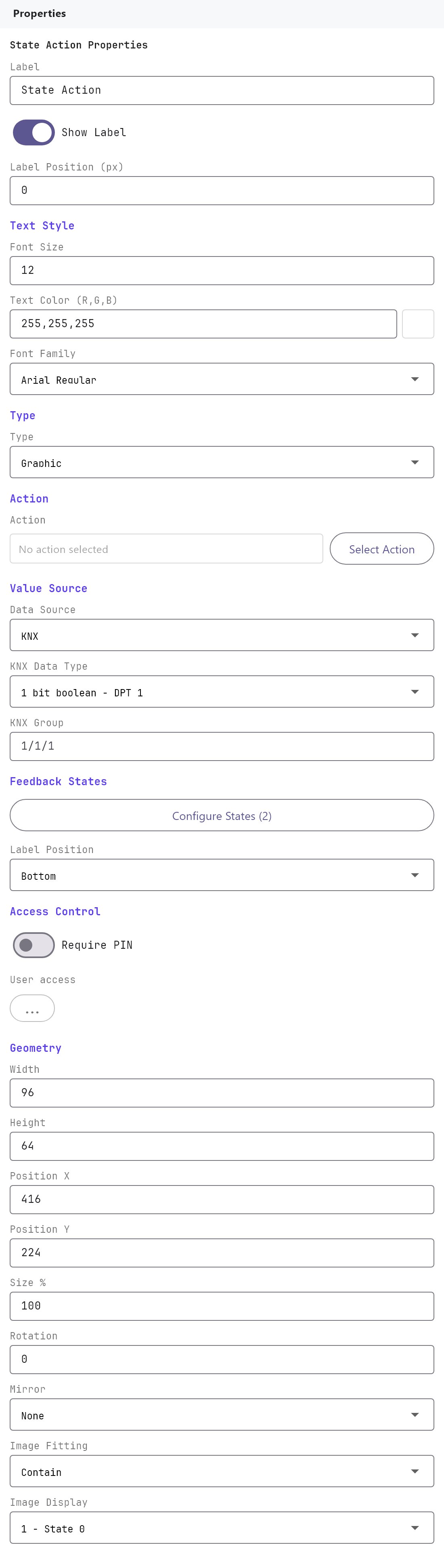
Label, Show Label, Label Position (the pixel nudge at the top), Text Style, Access Control and the Width, Height, Position X, Position Y, Size %, Rotation, Mirror, Image Fitting and Image Display fields work as described in Common properties. A new State Action is 96 by 64.
#State Action settings
| Property | What it does |
|---|---|
| Protocol | The source of the value: KNX (default), Zigbee, WiFi, MQTT or System Object. Choosing System Object removes the feedback states, and picking a system object makes the object show text. |
| Type | Graphic (default) shows the image of the active state. Text shows text. Set to Text when you pick a System Object. |
| Action | The command run when the object is tapped. Select Action opens the action library, Clear action removes it. Reads "No action selected" by default. |
| KNX Data Type | Only for KNX. How the value on the group address is decoded: 1 bit boolean - DPT 1 (default), 1 byte unsigned - DPT 5, 1 byte signed - DPT 6, 2 byte float - DPT 9, 4 byte float - DPT 14 or String - DPT 16. |
| KNX Group | Only for KNX. The group address the value is read from, such as 1/1/1. Empty by default. This is the address that drives the state, not the address written by the Action. |
| Value Source | Only for Zigbee, WiFi and MQTT. A free-text box for a device id, topic or endpoint. |
| Text Format | Only for Type Text with a non-System-Object protocol. Text with {value} replaced by the live value, for example Value: {value}. |
| Value Text Alignment | Only for Type Text or System Object. Left, Center or Right. |
| Feedback States | Not shown for System Object. Opens the States Editor. The button shows the number of states, for example Configure States (2). |
| Preview State | Which state the Configurator canvas shows while you design. It does not affect the apps. |
| Label Position | Only for Type Graphic. Bottom (default), Top or Disabled: where the label sits relative to the image. |
| Image Size % | Only for Type Graphic. 10 to 1000, default 100. It edits the same value as Size %. |
#When Protocol is System Object
| Property | What it does |
|---|---|
| System Object | The value to show, chosen from a grouped list: Solar Values (Dawn, Sunrise, Noon, Sunset, Dusk, Azimuth, Elevation), Muslim Prayer Times (Imsak, Fajr, Dhuhr, Asr, Maghrib, Isha, Hijri Date, Next Prayer Name, Time to Next Prayer, Next Islamic Event Name and Date) and Christian Events (Next Event Name and Date). Further groups appear only when you have configured them: Modbus RTU, Zigbee, Network I/O, Rule Gateway and Watering values. |
| Display | Value only (default), Label + value, Value + label, Label only or Custom text. |
| Format | For time values: AM/PM (default) or 24-hour. For date values: Short (8/15/2026) (default), Medium (Aug 15, 2026), Long (August 15, 2026) or DD/MM/YYYY (15/08/2026). |
| Custom Text | Only when Display is Custom text. Text using {label} and {value}, for example {label} {value}. |
#States Editor
Click Configure States to open the editor. The list on the left holds the states; Add, Clone, Remove, Down and Up manage them. At least two states must remain. A new object starts with State 0 (threshold 0, text 0) and State 1 (threshold 1, text 1). New states are named State_<n> with the threshold set to their position number.
| Field | What it does |
|---|---|
| Name | A name for the state. Shown in Preview State. |
| Threshold | The value from which this state applies. The state with the highest threshold that is not above the live value is shown. If the value is below every threshold, the first state in the list is shown. |
| Flashing state | Disabled (default) or Enabled. The object blinks while this state is active. |
| Flashing timing | Only when flashing is enabled. 100 to 5000 ms in steps of 100, default 500. |
| Image for state | The picture shown when this state is active in Type Graphic. Select image opens the gallery, Clear removes it. |
| Resize always | Only offers Disabled. |
| Command | A text box saved with the state. The apps in this version do not read it. |
| Hold press function | Disabled (default) or Enabled. Saved with the state. The apps in this version do not read it. |
| Text | The text of this state, used in Type Text. |
| Text dimension | Font size for the state text, 8 to 72, default 12. |
| Text color | Colour for the state text. Default 255,255,255. |
| Custom font | Disabled (default) or Enabled. When enabled, Font family appears: Arial Regular or Bold, Times New Roman Regular or Bold, Courier New Regular or Bold. |
#The action library
Select Action opens the same command library as the Action Button: the same categories, commands and parameters, grouped by category, with a description of each command. For page jumps you choose a Panel and a Page and a Close popup if opened value of 0 or 1. See the table in the Action Button page for which commands the apps actually run.
#How it behaves in the apps
- State selection: the object takes the live value from the KNX Group address, picks the state as described under Threshold, and shows that state's picture (Graphic) or text.
- Graphic type: shows the Image for state of the active state, with the Label above or below as set by Label Position.
- Text type: shows the active state's Text. The Veltnova client does not use Text Format.
- A state's own Text dimension and Text color are used in Text mode; the state's font family is used only when its Custom font is enabled.
- Flashing: the object alternates between full and nearly transparent at the set interval while the state is active.
- System Object: shows the gateway's value, formatted by Display and Format. There are no states.
- Tap: if an Action is set, a tap runs it (a page jump, or a KNX write). With no action, nothing happens.
- Rotation and Mirror are not applied by the Veltnova client.
#Example
A garage door status icon on KNX:
- Add a State Action. Set Label to
Garage. - Protocol:
KNX. Type:Graphic. - KNX Data Type:
1 bit boolean - DPT 1. KNX Group:3/0/12(the door's closed-contact status address). - Open Feedback States. On
State 0(threshold0) set Image for state to a closed-door picture. OnState 1(threshold1) set it to an open-door picture. Turn Flashing state on forState 1with Flashing timing500if you want the open door to blink. - Label Position:
Bottom. - Optionally add an Action: Open Panel/Page on Every Client with Panel
Garageand PageCameras, so a tap opens the garage cameras.
A text display of the sunset time:
- Add a State Action. Protocol:
System Object. - System Object:
Solar - Sunset. Display:Label + value. Format:24-hour. - Label:
Sunset. Value Text Alignment:Left.
#Tips and common problems
- The icon never changes: check KNX Group (not the Action's group address), the KNX Data Type and that the thresholds are in the right range for the value.
- The Action's KNX write and the KNX Group are separate settings. A tap that writes to a different address than the one you read is common for status icons.
- Text shows
0or1instead of words: change the Text of each state. - Only KNX values and System Objects were verified end to end for this page. For Zigbee, WiFi and MQTT, test the object on a real project before relying on it.